Reading e-books has become increasingly popular, and has profoundly altered people's reading experience. As an ebook reader, so much as I enjoy the huge convenience ebook has brought to me, I realize that the current ebook reading experience often results in poor reading concentration and worse comprehension of the book content.
I'd like to explore how we could create a more proactive reading experience that can stimulate deeper reflection and comprehension of reading materials.
Increased use of e-readers
Major user group:
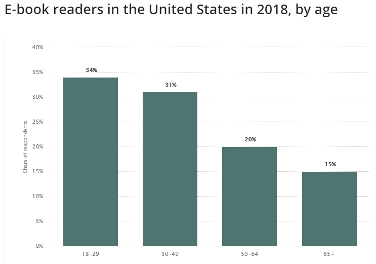
Young adult
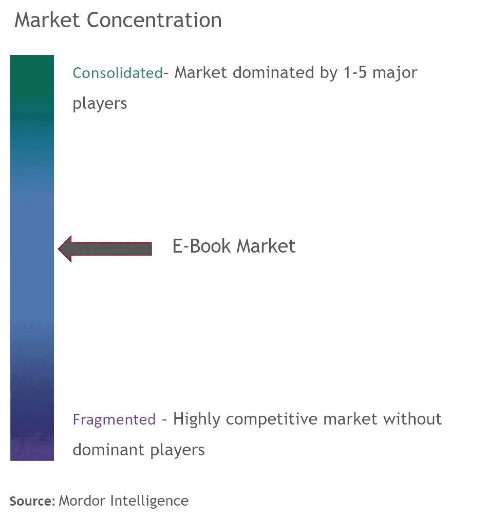
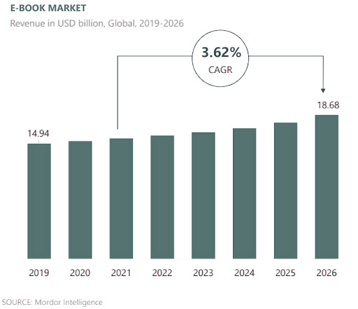
Fragmented market with major players
Reference:
https://www.statista.com/statistics/249767/e-book-readers-in-the-us-by-age/
https://www.mordorintelligence.com/industry-reports/e-book-market
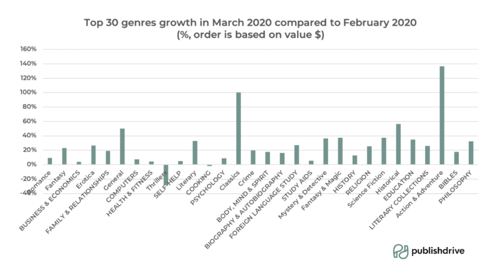
Ebook reader used to favor easy, leisure reading. During Covid-19, research observed an obvious sales growth of non-fictions, educations, and language study books, indicating e-readers start to read with an educational purpose, looking for personal development.
Reference:
https://journalpublishingculture.weebly.com/uploads/1/6/8/4/16842954/howell.pdf
https://publishdrive.com/hows-the-book-market-best-book-genres-during-covid-19.html
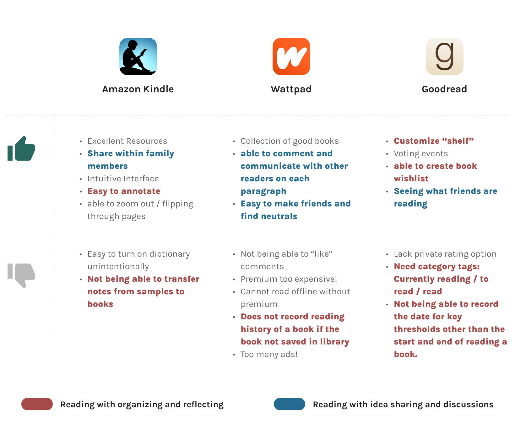
After picking 3 product as competitors, I pulled out user reviews from appstore and summarized what the insights into a sheet, to better understand the needs and pains of e-book users.
There are 2 major findings from this analysis:
Among the things that users like, many are related to sharing ideas and discussing with others.
Users are in general not happy with features regarding reading management, like organizing notes, managing reading history, etc.
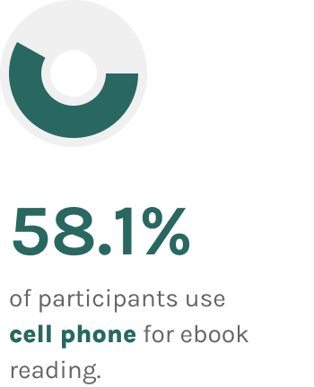
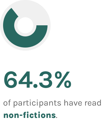
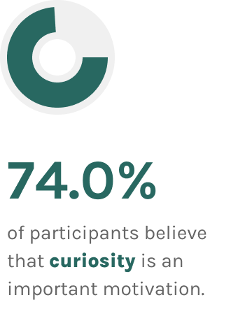
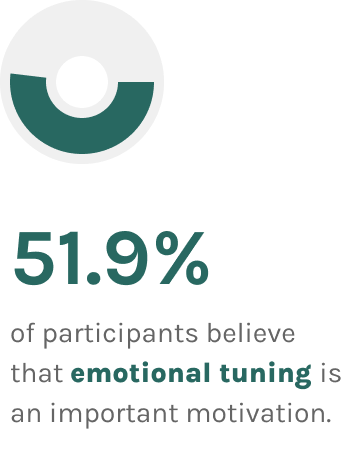
27 Participants for user survey
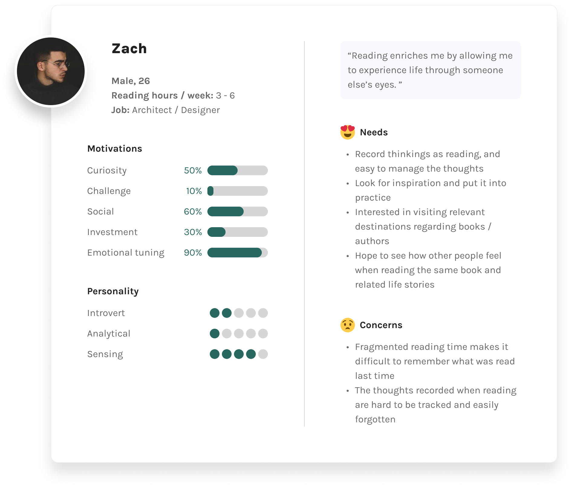
From secondary research, I learned that e-readers' needs to discuss, reflect and comprehend book content is not fully met. It's a composited result of multiple phenomena, including fragmentation of reading time, the increase of non-fiction reading, lack of reading management tools.
With all the learnings in mind, I conducted user survey and interviews to further study behavioral details of users and their pain points. The purpose of the survey is to screen interview candidates and get additional quantitative data that's complementary to the secondary research.
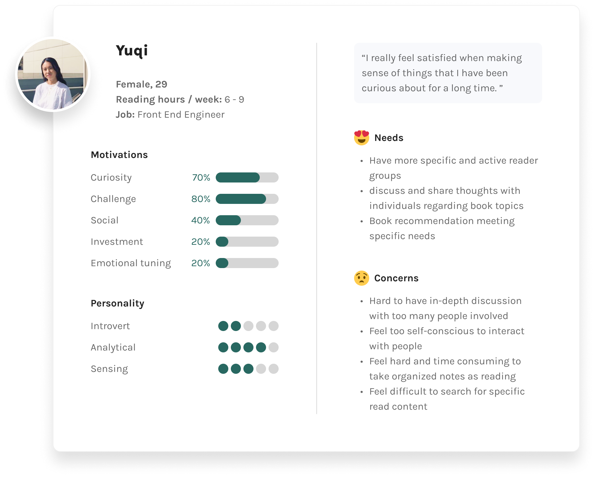
5 User interviews
Participants were selected based on the following standards:
Users aged 18 - 35, all genders
Have a consistent reading habit
Have experience in ebook reading
Data collected from review is used to improve group matching function overtime
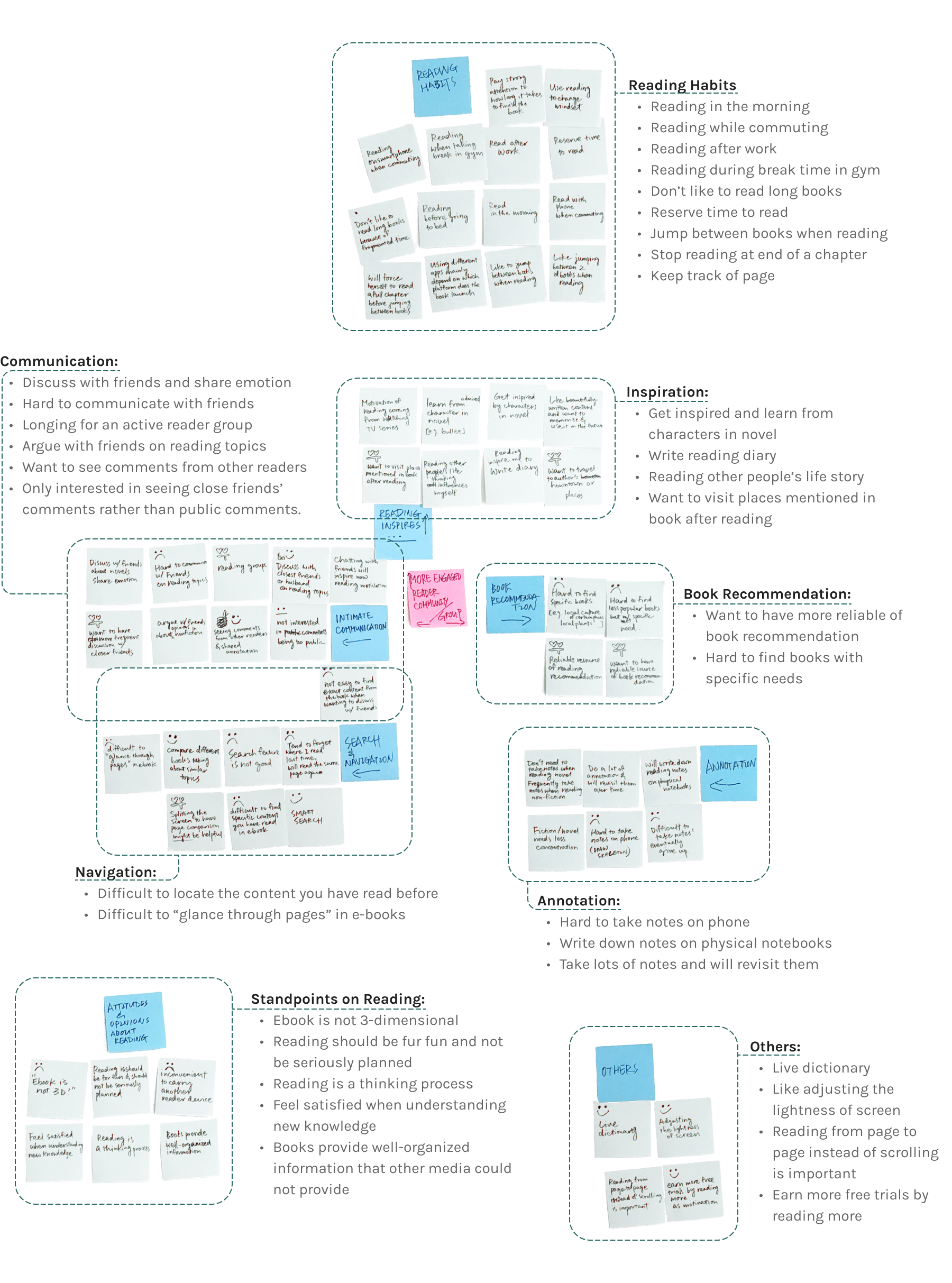
Research questions were focused on three major aspects: reading habits, reading motivations and stories in regards to e-book reading. The insights were collected and re-categorized into an affinity map shown as follows.

The HMW questions is naturally developed based on the previous research. All of the frustrations and pain points I have seen can fall into the 4 categories above.
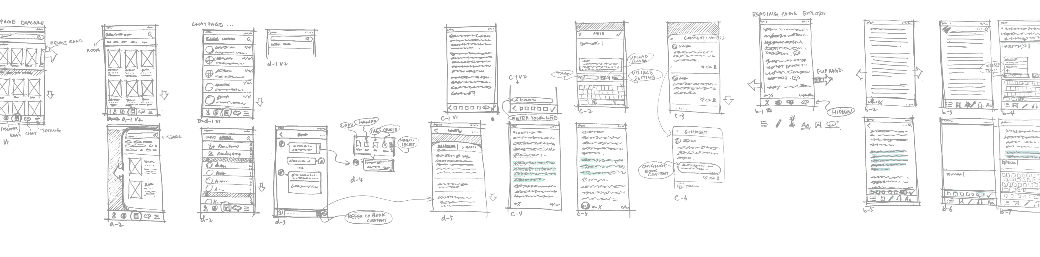
Treating the HMW questions as the basic problem statement, I started to brainstorm possible solutions for each problem before sketching them out. At this point, the ideas were random and in chaos. Some of them are demonstrated here:

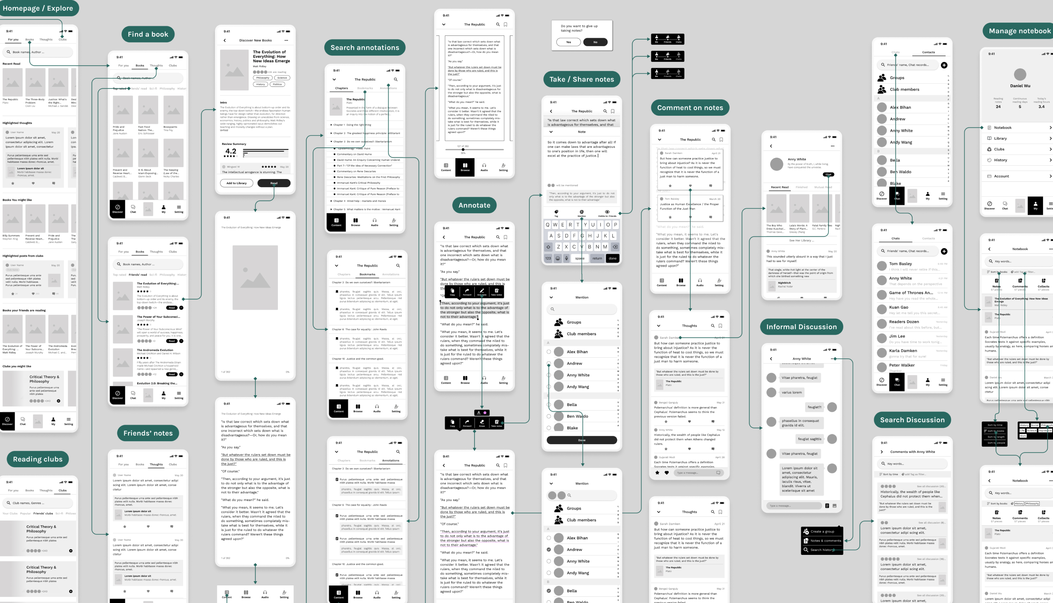
As the initial ideas got distilled and more refined with the study of information architecture, site map and user flow, I created an paper prototype for MVP, which later evolved into a low-fi prototype.
I conducted guerrilla testings with 5 people with the paper prototype. All the feedbacks were digested and incorporated into the development of the low-fi prototype.
“When I first saw the homepage, I thought this was just a normal e-book reading app, and not realized the things you introduced to me.”
5 Participants for usability testing
I conducted 2 rounds of usability testings, one with low-fi prototype focusing more on flows, layout and functionalities, and the other one with hi-fi mockup concentrating more on accessibility, copies and details.
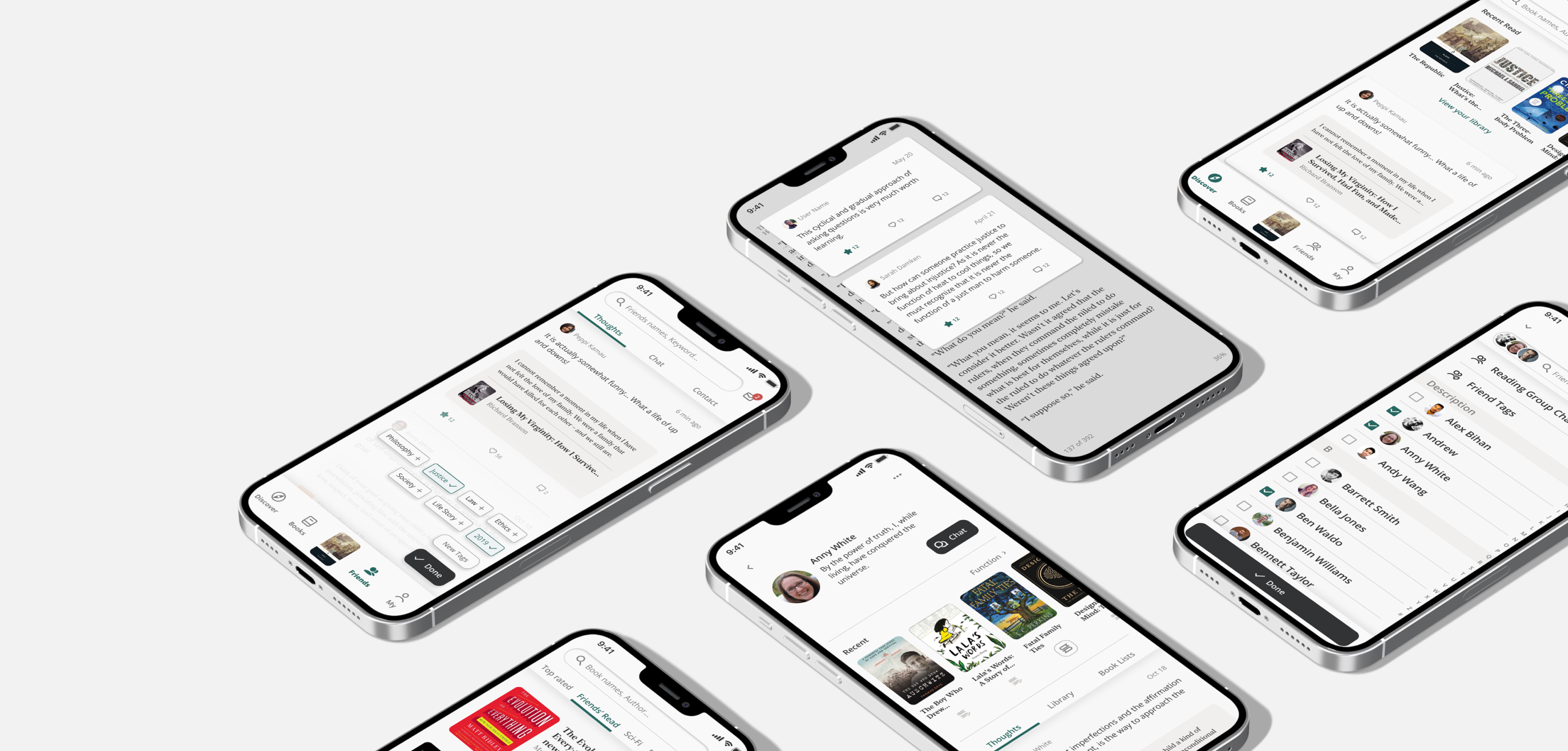
In this case study, I will introduce the design along with and test findings and iterations altogether by themes responding to the HMW questions: to discover, to share, to discuss, and to organize.
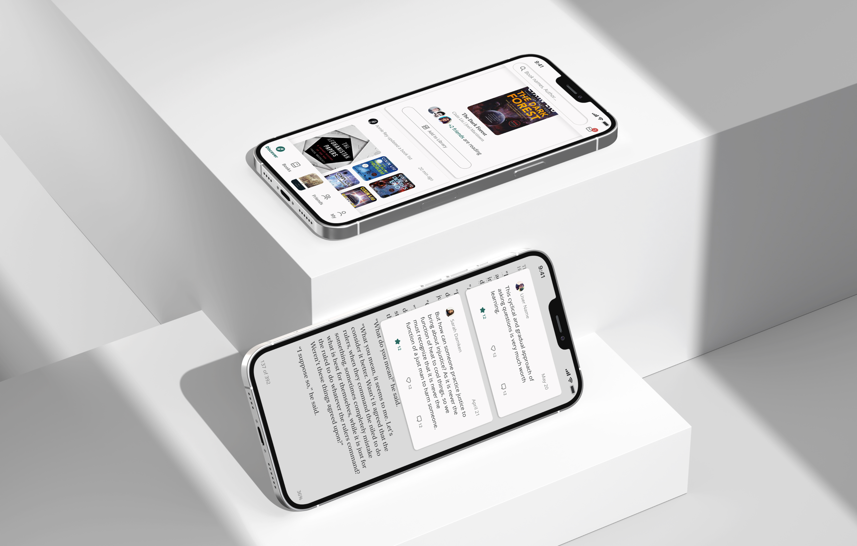
To Discover
Before
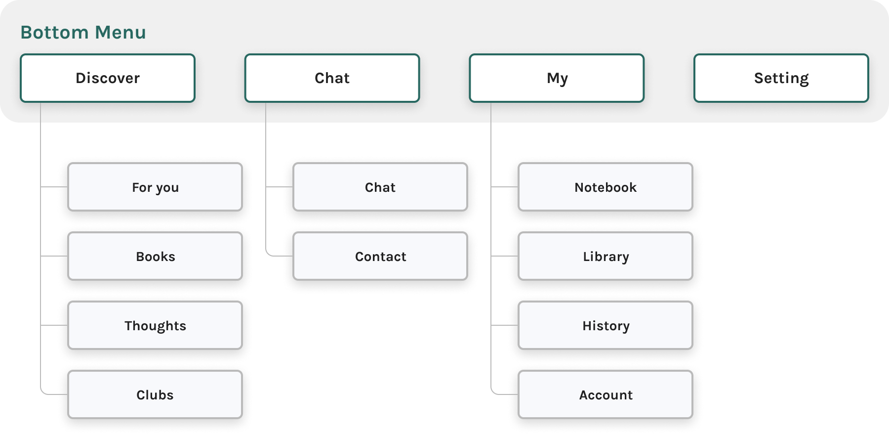
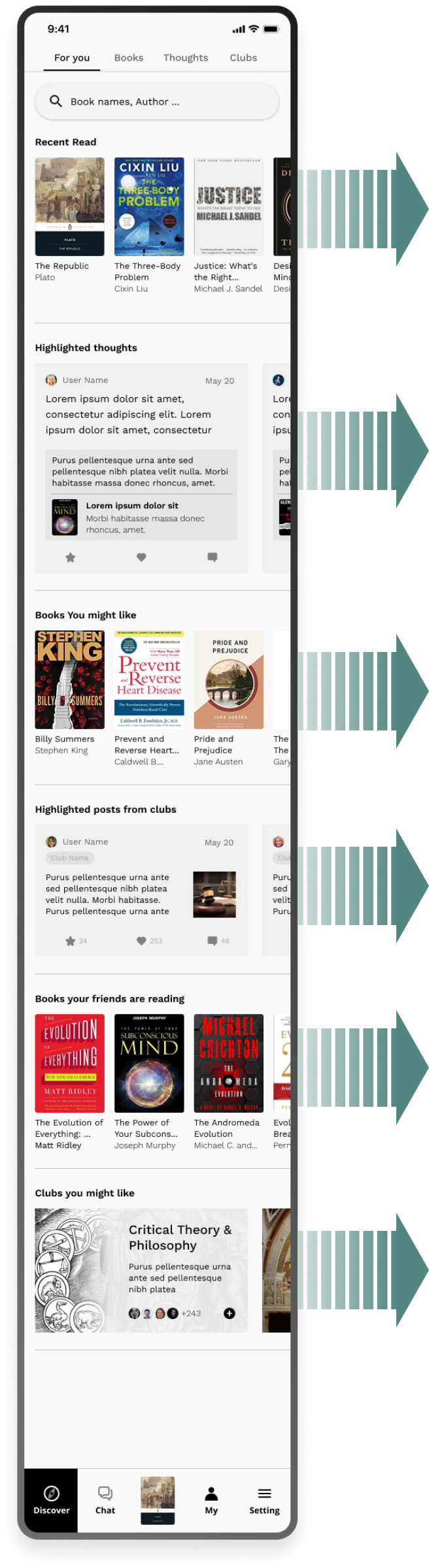
The bottom menu fails to illustrate the intention of the app. People can't tell it's an e-book reading app by looking at it.
All the major categories (books, thoughts, clubs) are in the “Discover” Panel, which makes the secondary tab bar more important than the primary navigation.
Too complicated for MVP.
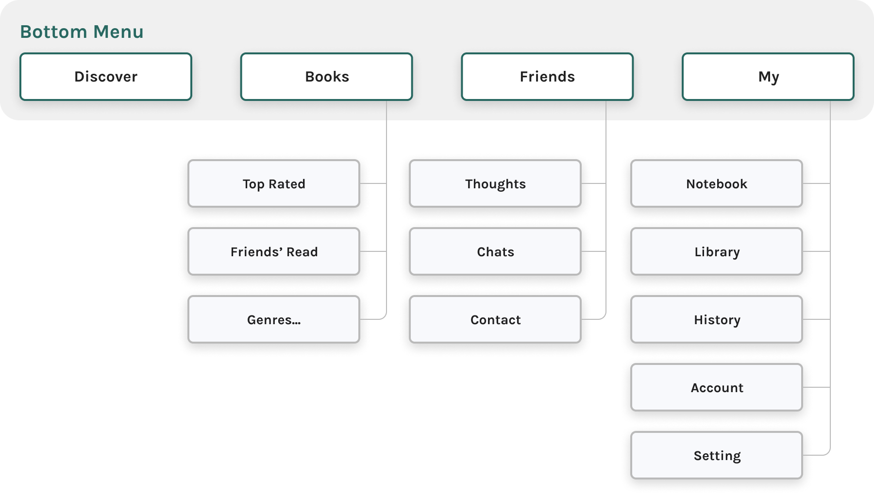
After
Get rid of “club” feature, simplify the scope of MVP.
Re-structure the navigation bar to clearly demonstrate the “Reading with friends” idea.
Before
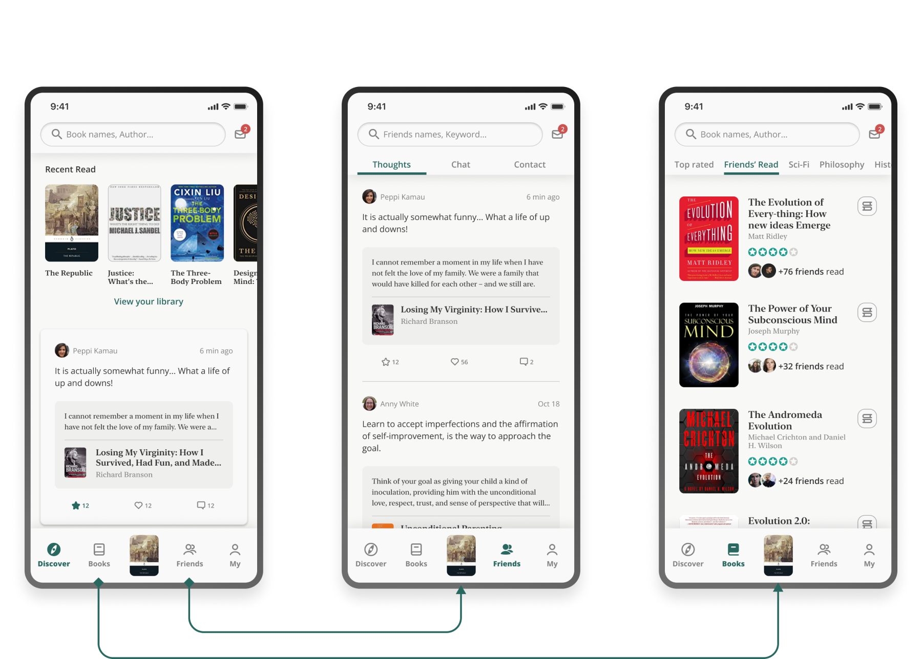
Users scroll to see different categories of contents, and swipe to check different feeds of the same type.
In usability testing, most of the participants would just scroll to the bottom before trying the swipe.
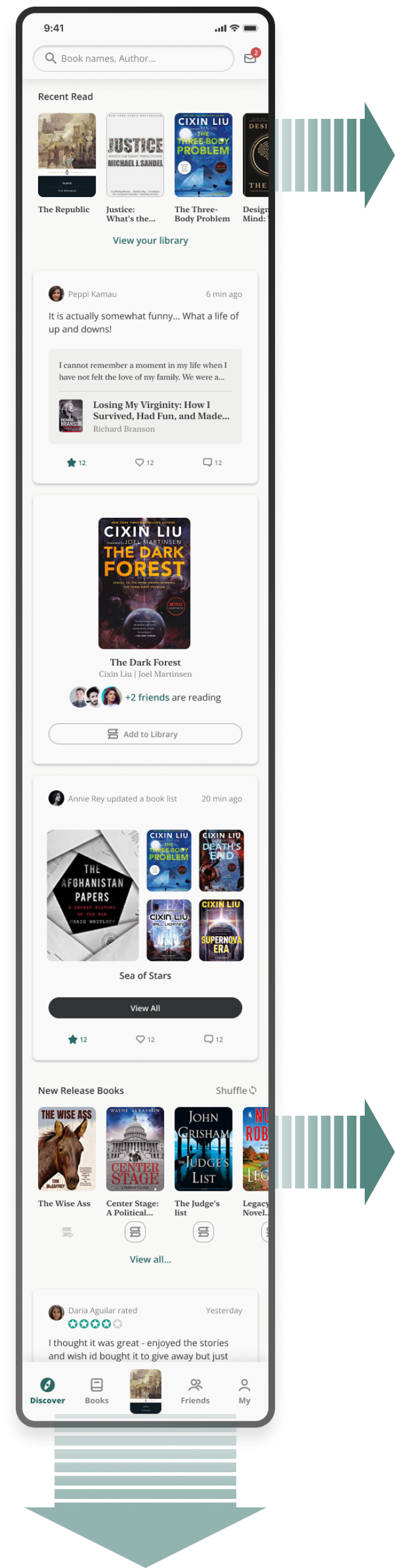
After
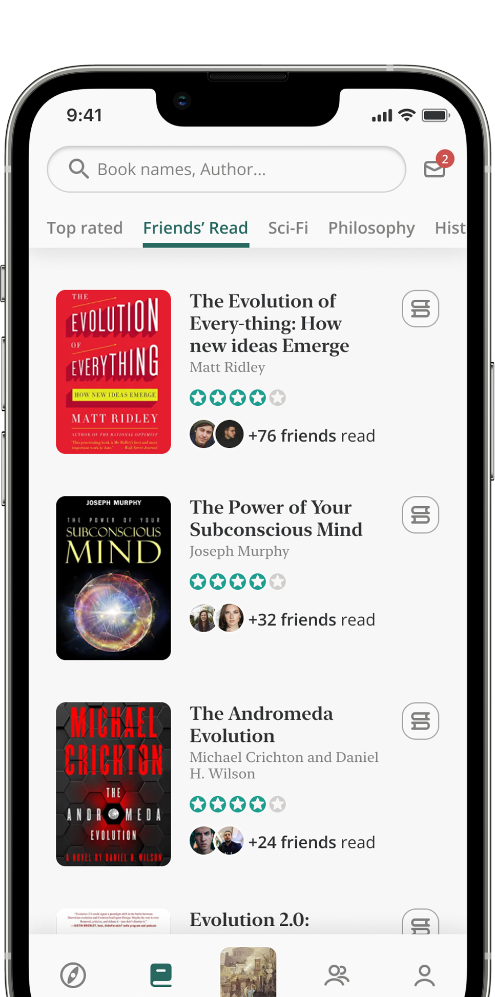
In the revised “explore” page, users can scroll infinitely to see different feeds.
Contents are more related to friends, like new thoughts posted and book list updated by friends, etc.
To share
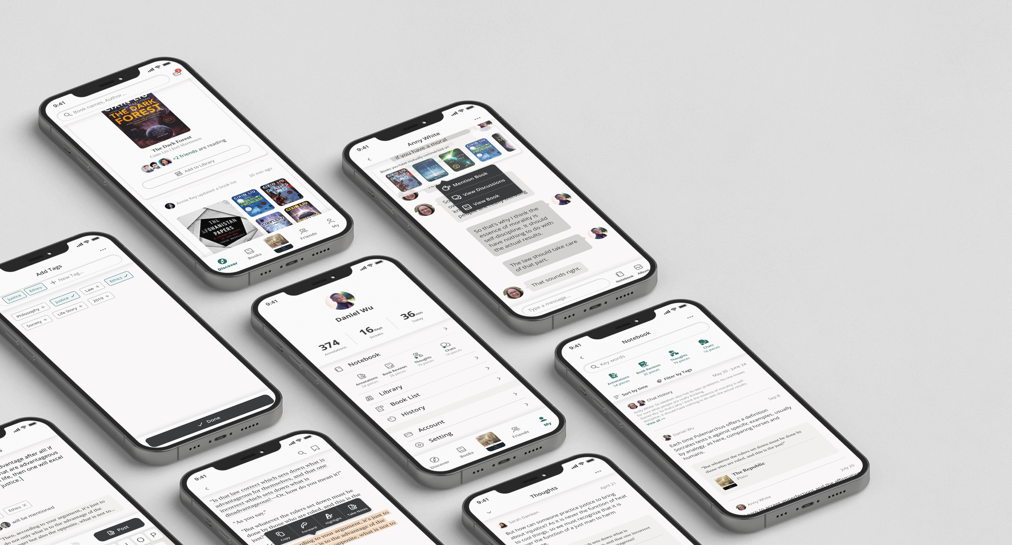
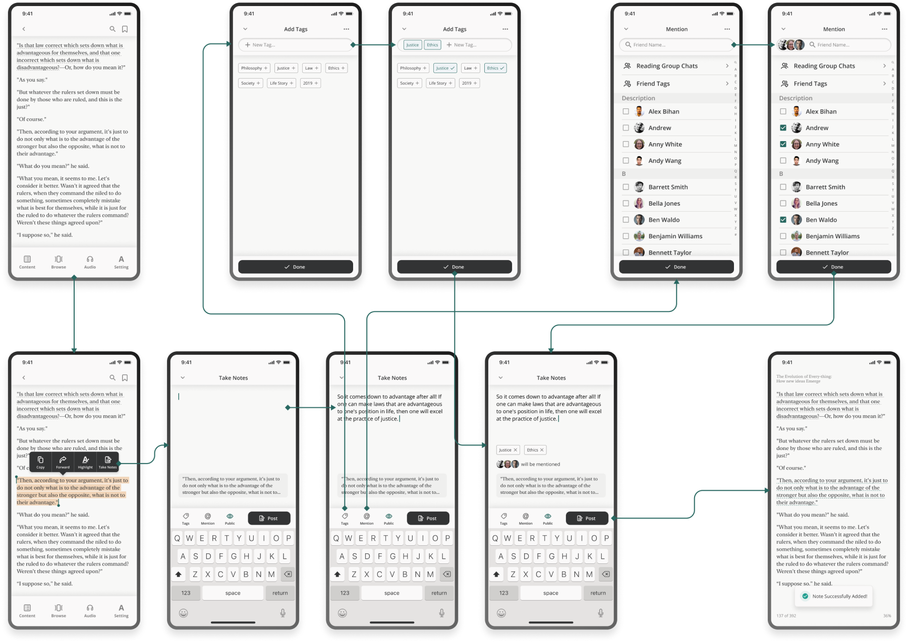
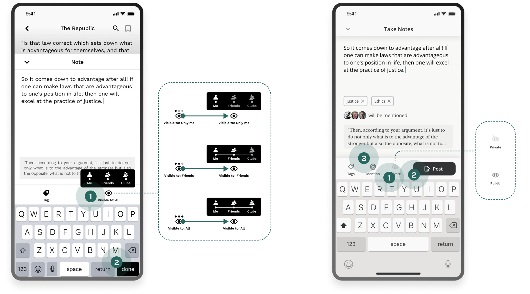
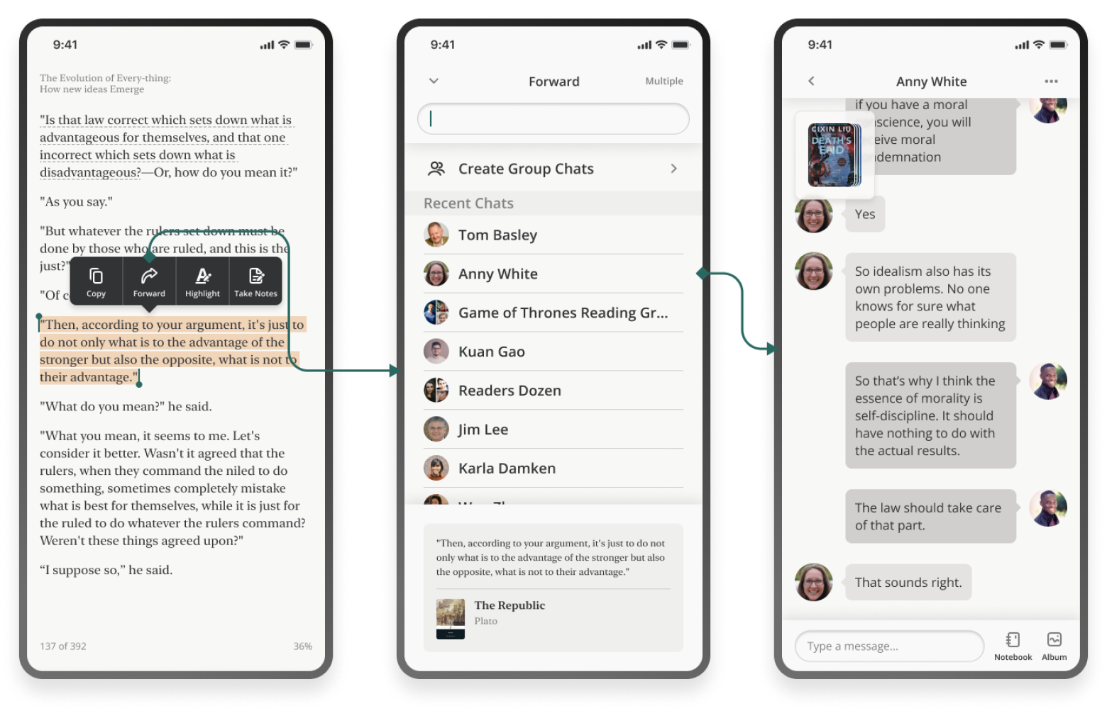
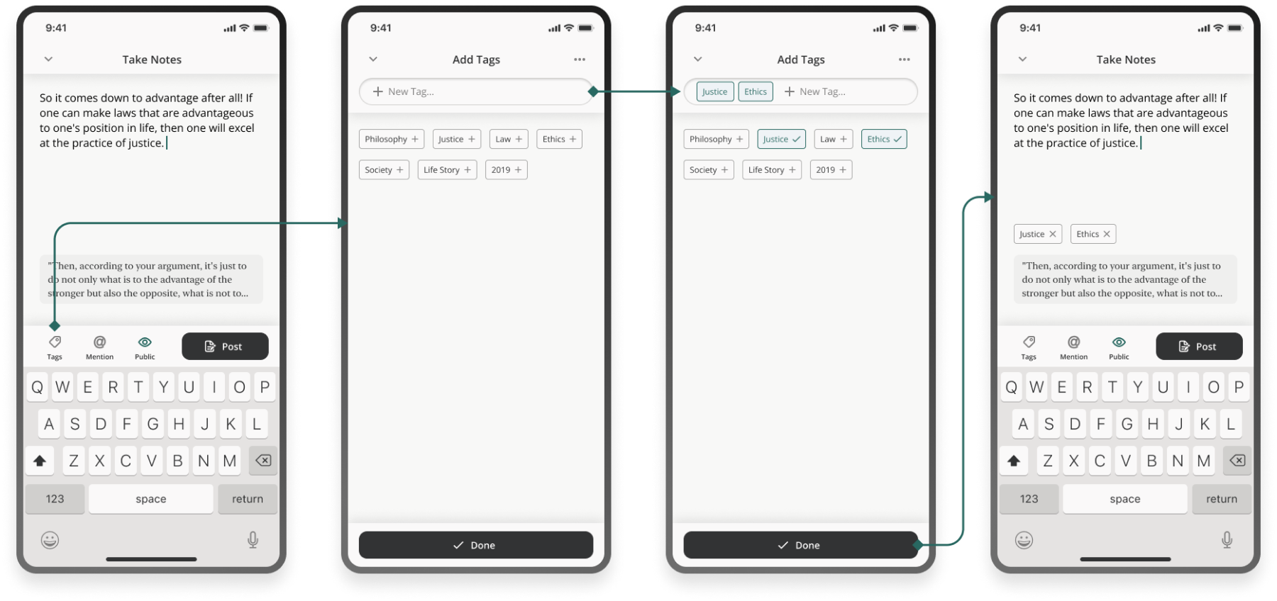
When doing annotation and taking notes, users can add tags to notes for managing purpose, and decide if it is public or private. In addition, users can mention specific friends in the note, regardless of whether it's public, the target people will get notified and access to the note.
Before
- 1
Sharing to friends but not public is trivial. Users tend to follow lots of strangers as friends in e-book app.
- 2
2 cta (return and done) is confusing.
After
- 1
Simplify the setting by only offering 2 mode: public and private
- 2
“Post” button location moved
- 3
The “Share to friends” option got expanded into this “Mention” feature, allowing users to share and notify specific people.
To Discuss
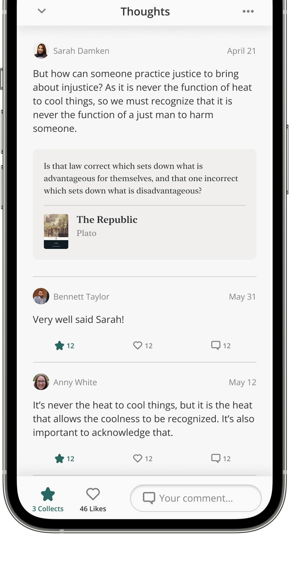
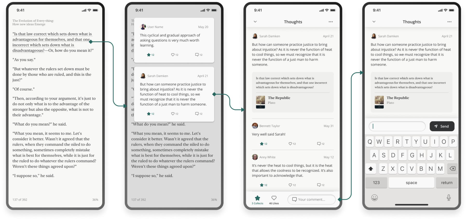
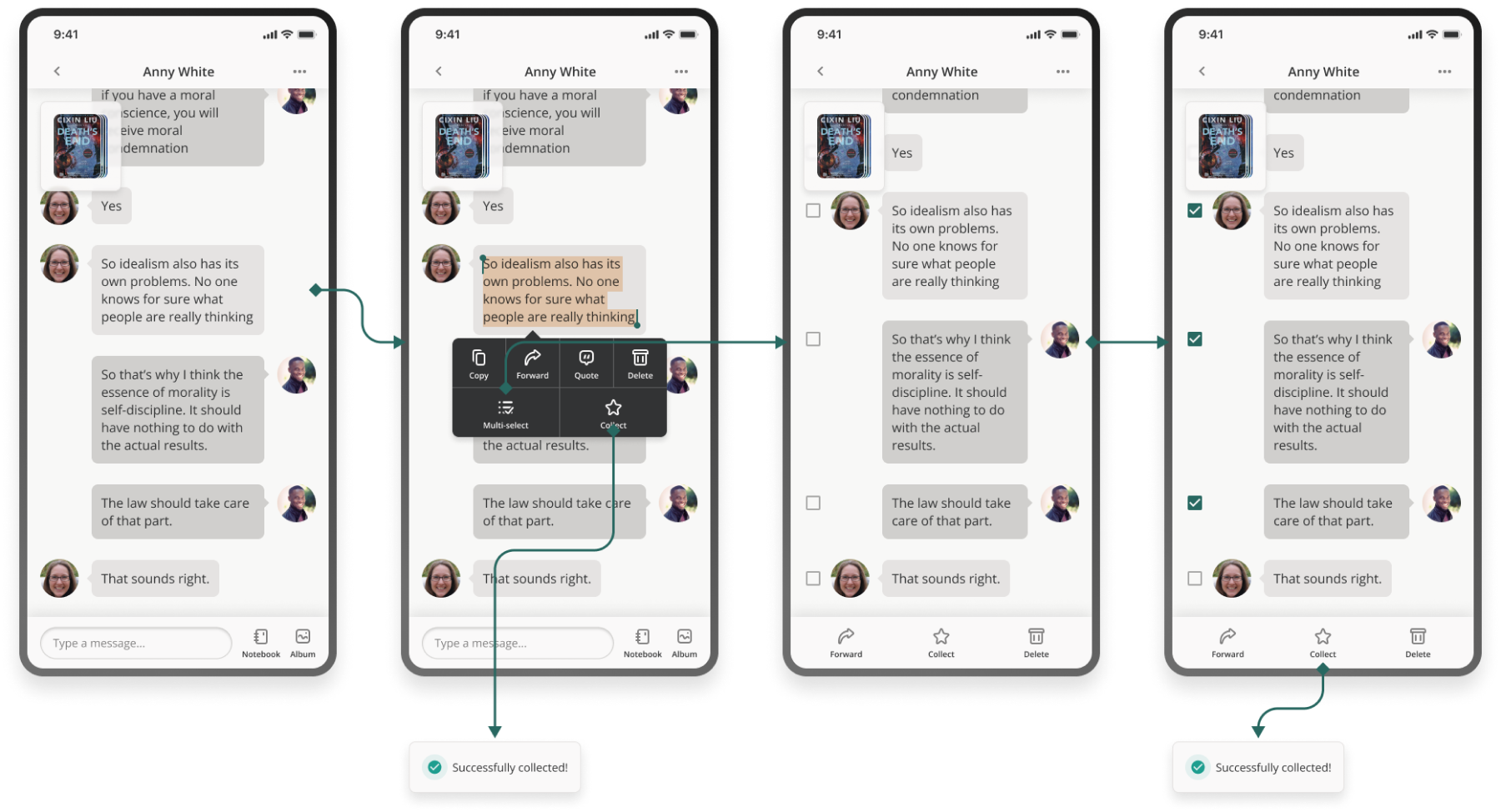
Users will be able to see other people's public notes when they read. They can have a public discussion by commenting under the notes. Users can also comment directly below other people's response.
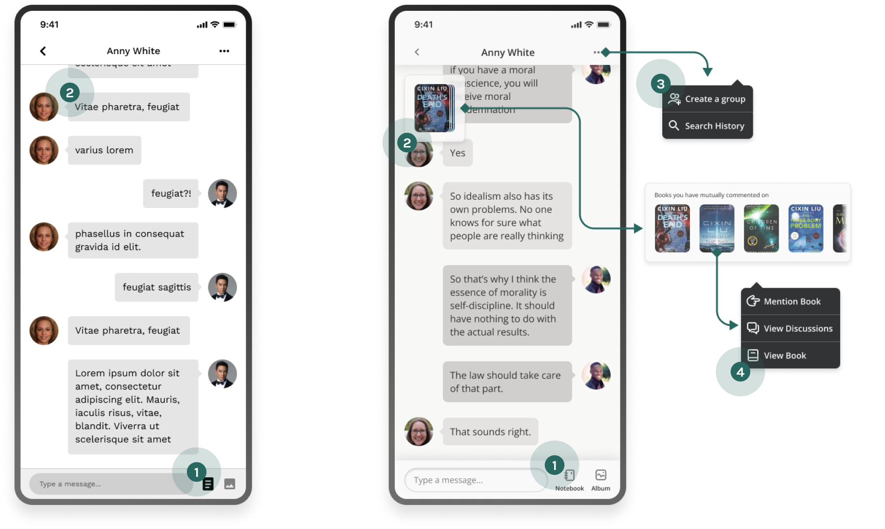
In the previous user research, some people mentioned that they tend to feel uncomfortable to have in-depth discussion in a public realm. That's why Reapal provides a private discussion mode. Users have the options to switch to a private chat mode with a specific person or a group of people.
Before
- 1
It's not obvious what the icons represent.
- 2
Users feel the screen is too general and doesn't look like a feature from an e-book app.
After
- 1
Text added to the bottom of icons
- 2
A floating drawer indicating mutual books the users have read.
- 3
Add an option to create a reading group.
- 4
Add an easy way to trace back to public discussion the users had.
People mentioned in the user research that the discussion could be triggered in different ways. That means to make the discussion feature successful, users should feel easy and intuitive enough to get to either comment page or chat page from any screen, and be able to smoothly switch between comment and chat.
I considered multiple scenario and designed flows accordingly.
From comment page to chat page
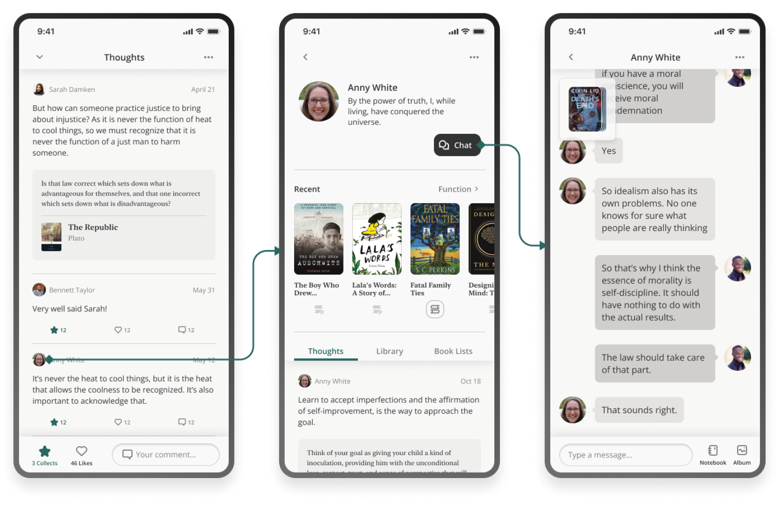
From reading page to chat page
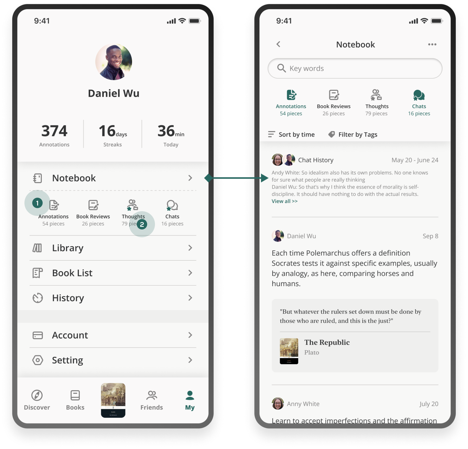
To Organize
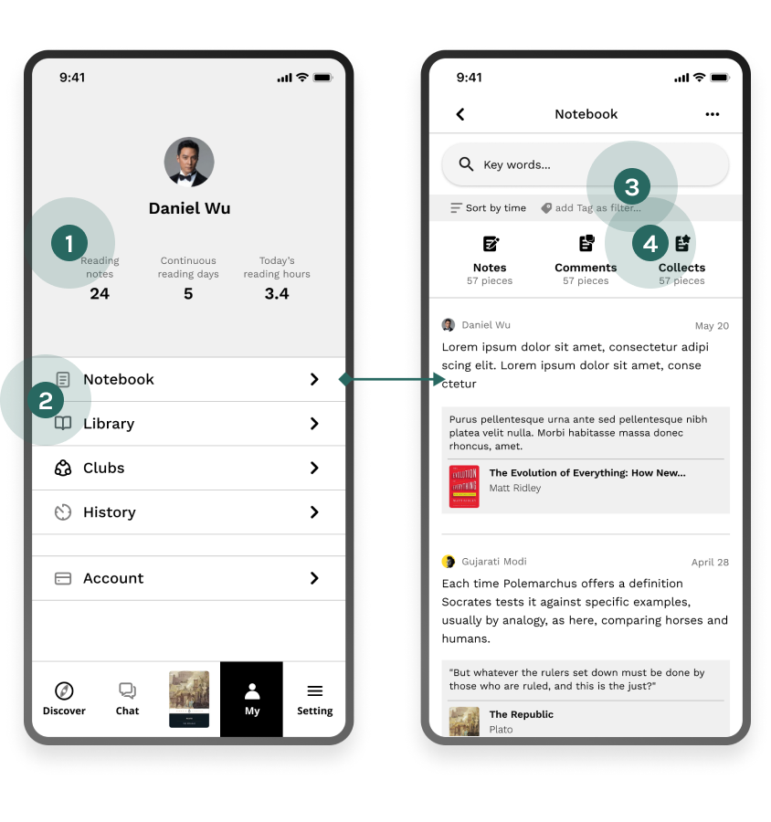
Earlier research have shown that many people are frustrated about worse comprehension and being easy to forget what's been read. Therefore the notebook feature is important. In Reapal, users are able to keep track of all the histories, and review all the annotations and discussions in different manageable orders.
Wireframe
- 1
Copies are too complicated.
- 2
Users don't expect to see comments and saved items in notebook.
- 3
“add tag as filter” is confusing to users, people thought they are supposed to add new tags.
- 4
Users have trouble understand what does “Collects” mean.
Hi-fi mockup iteration 1
- 1
Copies simplified and layout refined.
- 2
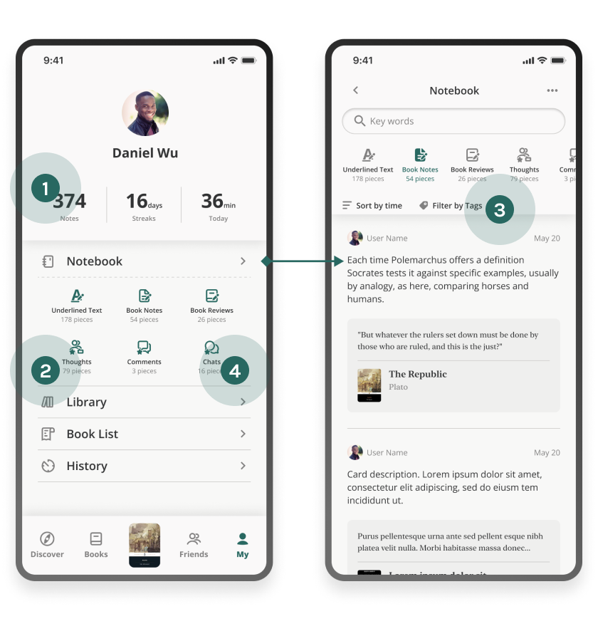
Preview all the sub-categories before entering notebook
- 3
Copy clarified: “Filter by tags”
- 4
Users think the categories is too complicated and hard to understand the difference between thoughts, comments and chats.
Hi-fi mockup iteration 2 - refine categories
- 1
Combine “underline texts” and “notes” into “Annotations”
- 2
Combine “Thoughts (Friends' thoughts)” and “Comments (My thoughts)” as “Thoughts”
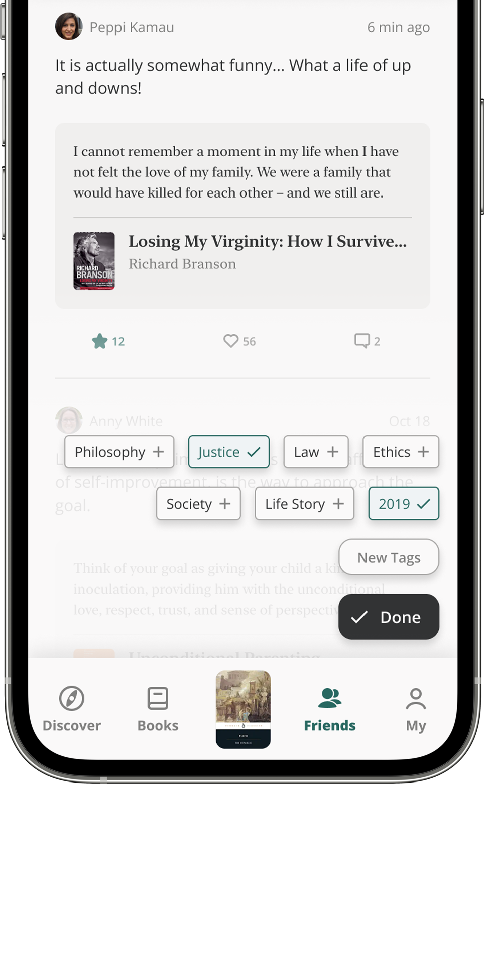
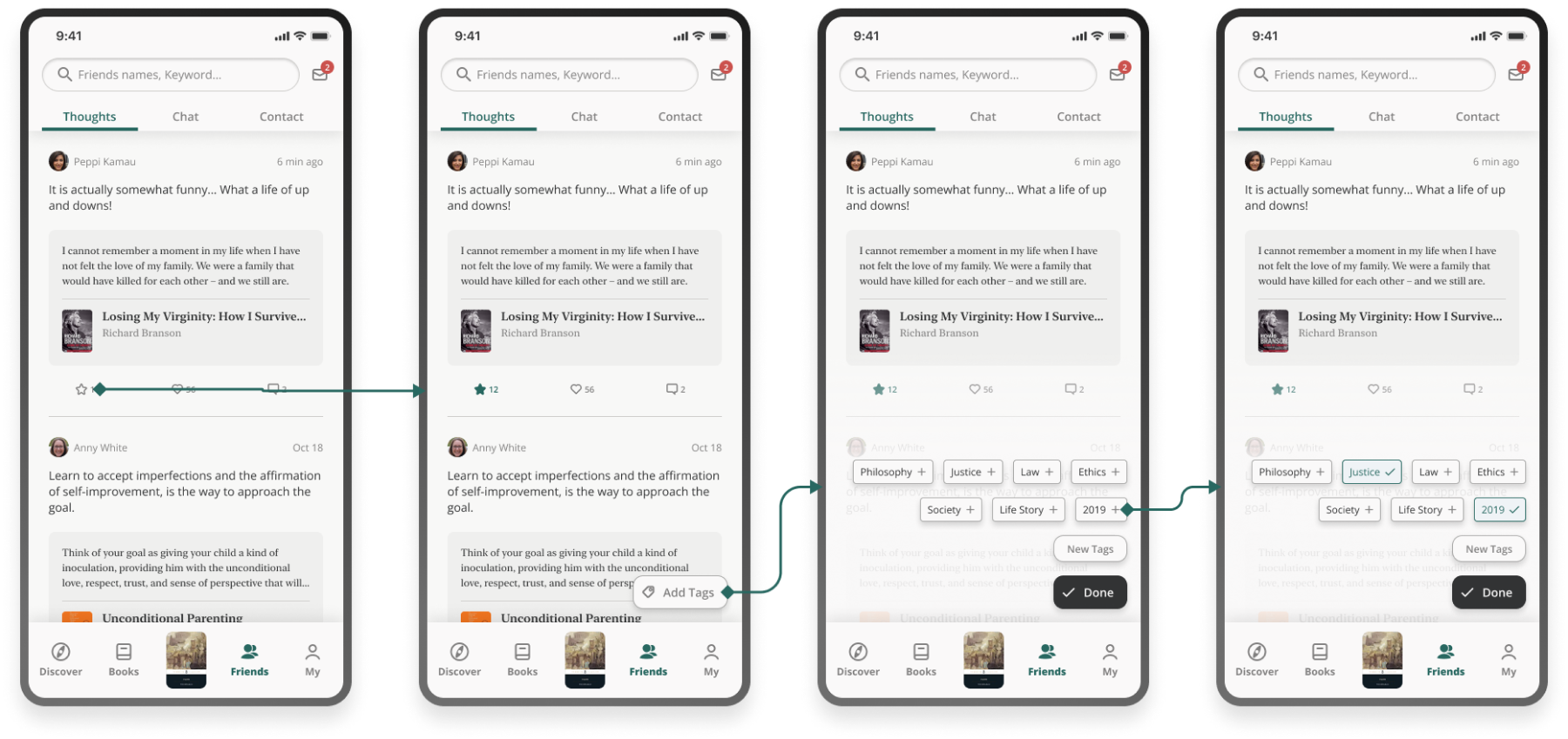
Tagging is an important system used to manage the notes. However I don't want the flow of adding tags to complicate the overall flow and add additional cognitive load to users. Therefore I managed to make it intuitive and optional. If users are not interested in adding tags, they will not feel interrupted at all.
In Reapal, tags could be applied to three different items: notes, thoughts, and chats.
Organize notes
Collect and organize thoughts
Collect and organize chats
Circle back to problem statement
It's helpful to evaluate solutions by checking if it provides an appropriate answer to HMW questions.
Always think about the scope of MVP
Consider the available resources in reality.
For product that might get too complicated, think about development phasing in ideation stage.
Copy matters
Copies need to be short and precise to deliver ideas efficiently.

